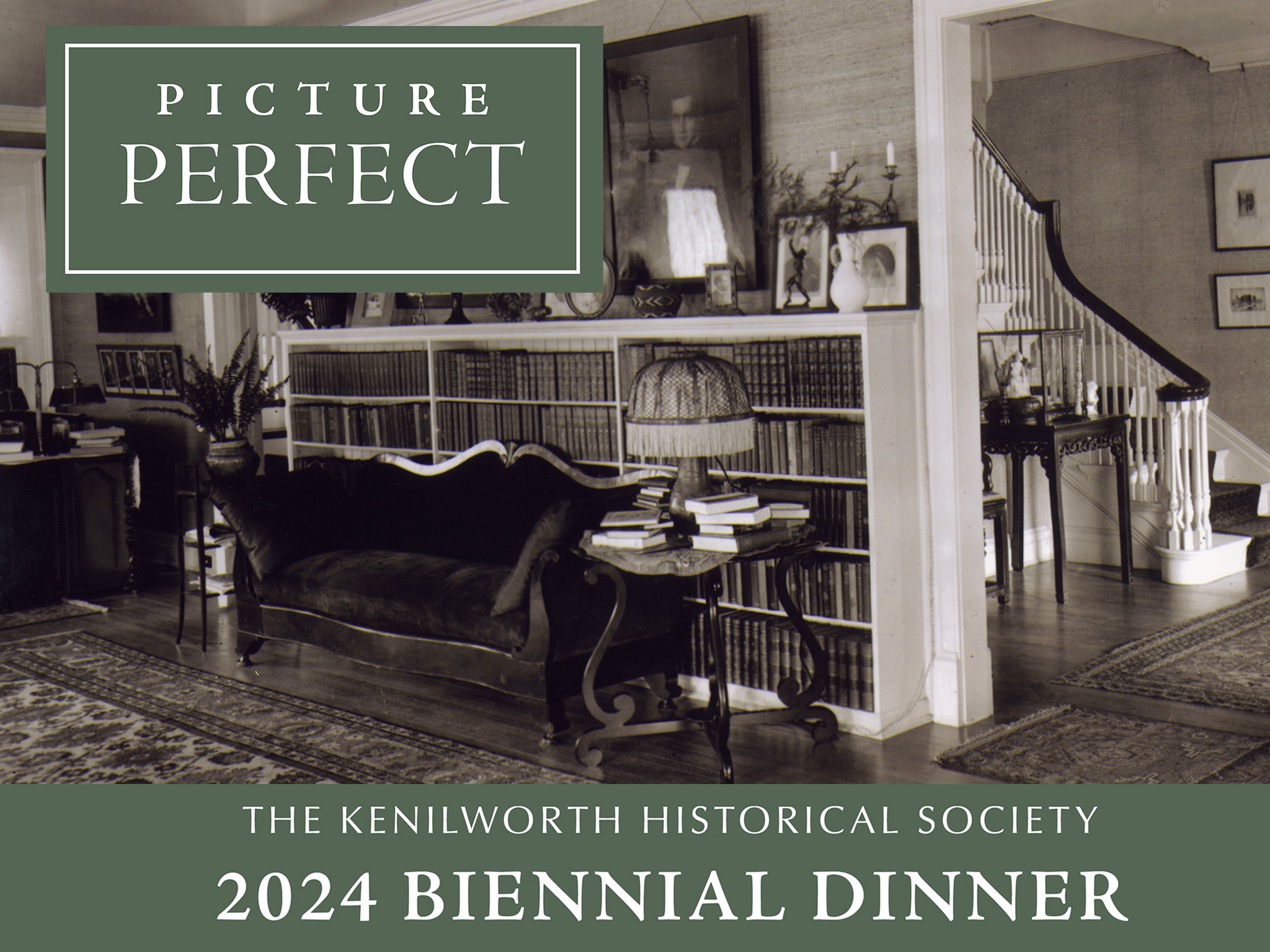
2024 KHS Biennial Dinner
A success! Thanks to collaboration and a helpful design Style Guide.
Variety is the spice of life.
Same goes for social media. When promoting an event, a few different ads can really hold people’s attention. This can be done with different elements, but mainly with different and interesting images.
While the images should change, the core message should be consistent. This can be achieved with continuity of colour and design elements (shapes, logos, typeface). The call to action should be the same in all elements of the campaign.
We used this approach when planning the campaign for The Kenilworth Historical Society. The call to action was to drive the viewer to sign up for their biennial dinner. The topic was the history of this small north shore village as seen “Through the Lens of Its Iconic Homes” exhibit.
Black and white exterior and interior photos from throughout the village’s timeline were used to focus on the design and history of the architecture. To tie the campaign together the same green border and event fonts and logo were used in all promotional items from online to web to direct mail.
We are your online consultants
We are your web designers
We are Your Plan B Company!
