Lake Picnic Invitations
“Guests commented that the invites were the BEST in the history for this annual get-together! Thank you for a great design and fast turnaround.” – Barb + Curt A.
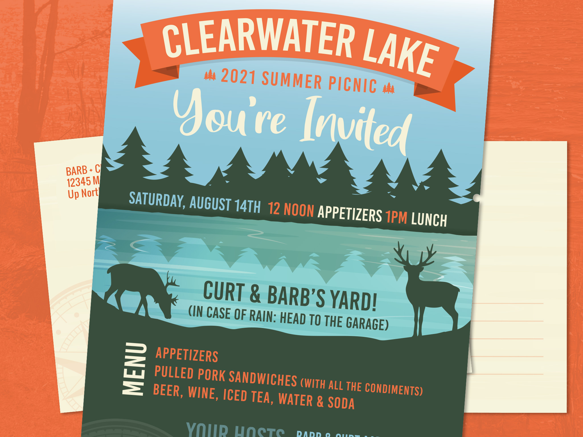
From colours to the choice of paper, design covers every aspect of a print piece – from a 3 fold brochure to a mailable flyer for an annual picnic in the north woods of Michigan.
While a glossy paper might work for a tech company, a picnic at a log cabin calls for a more tactile and natural feeling paper – which is why I chose uncoated / matte paper for this print invitation.
The woods invokes a natural palette of colours to use in a design, deep greens, the blues of a lake, natural off-whites, and the orange of the sun! Just like colours, fonts and line art can come in a huge variety of styles, so it is important to combine design elements that keep the message consistent and clean and easy (and fast) to “read.” A good design should feel cohesive, and it should not be evident how many individual elements might have been used to piece together the final design.
These CMYK, 2 sided, 6×9”, mailable postcards were a success – and the event had a great turnout (PLUS they had great weather for their annual event)!
We are your print designers
We are your web developers
We are Your Plan B Company!
