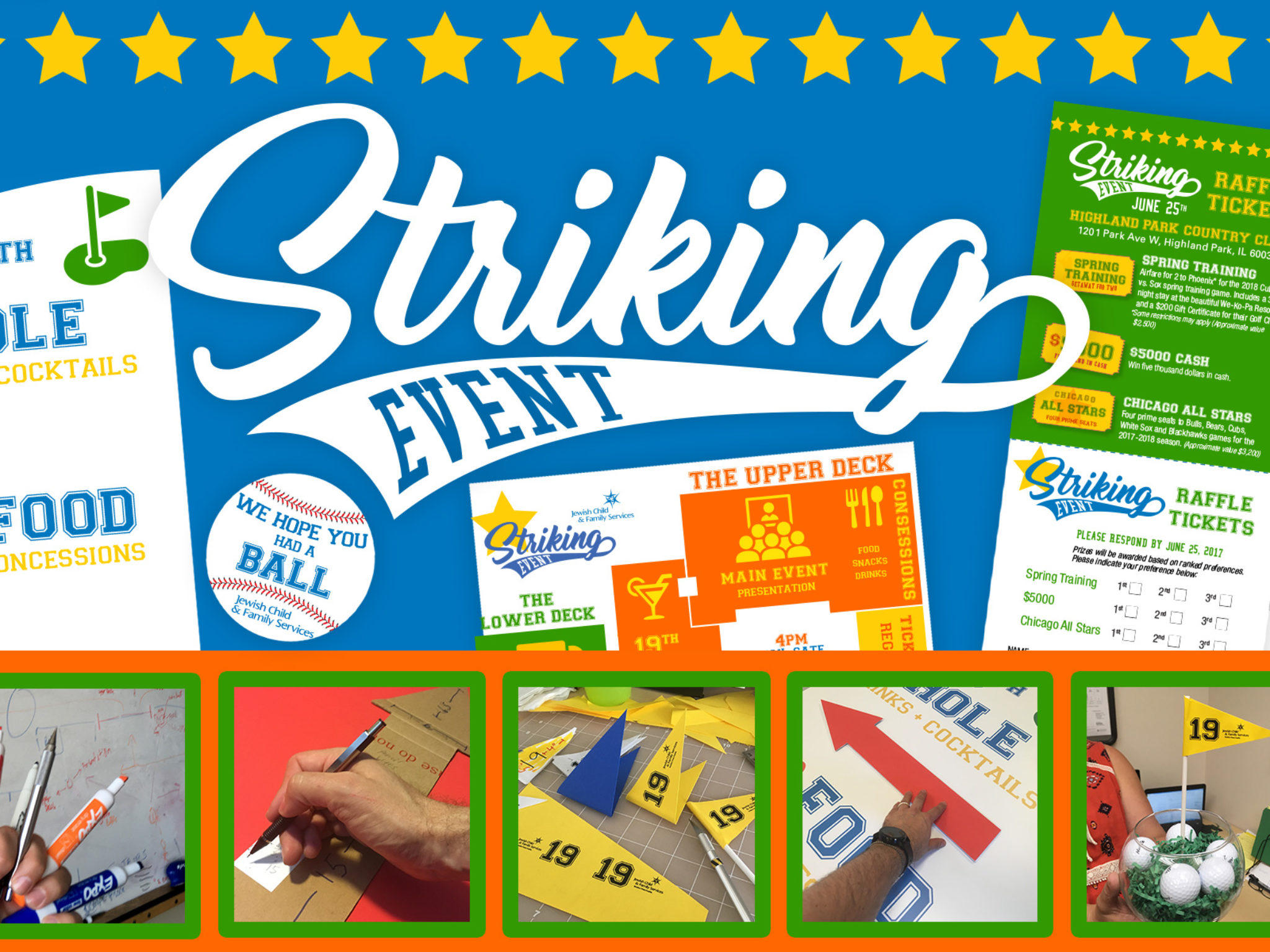
Striking Event (JCFS event)
Warm summer breezes. The crack of the bat. Cheering for the home team. Sports invoke an emotional response for many people. It may bring to mind your team’s colors or a fond memory of your own school days kicking the ball around.
Jewish Child and Family Services’ Annual Benefit uses the celebration and excitement of sports to celebrate and honor their own home team – providing caring and healing services to Chicago-area families in need.
Since celebrations are usually colorful affairs, great care was taken to discover the most common colors used across all types of sports branding. 100s of logos examples were collected to get a feel for what encompassed the feeling of all sports. By mixing these colors with a collegiate font and a swoosh reflecting the movement of sports, a custom logo reflecting both modern and old fashioned was created to brand every aspect of the event.
Every aspect of the event had to match, and tell the same story of using sports to celebrate JCFS. Consistency and continuity are key to bringing a large even like this together. Everything had to match…the logo, invitation package, tear off raffle tickets, flyers, event signage, programs, floor plan map, giant wayfair signs, USB thumbdrive gifts, bag stickers, cookies, name tags, tabletop signs, pennants, balloons, table cloths and table runners, sport-themed centerpieces, staff T-Shirts, Constant Contact email blast, and down to the logo at the bottom of the Photo booth prints.
With any event this large, many custom items must be created. Some can just be printed, some take more planning. The challenge for this event were the pennants and giant wayfair signs. To save money from sending away for them, the pennants were designed and printed on bright colored paper – to be cut out by hand and glued together around a short dowel.
The wayfair signs would also prove to require a more hands-on approach, and creative problem solving. the signs were over 2 feet wide and 6 feet tall. Each character had to be 2-3 inches tall, and not to low on the signs, so they could be read from down the long corridors of the Highland Park country club. Everything was planned, but with any large event, “sand-traps” pop up along the way. In this case, the exact location of the activities and signs placement was not going to be exactly known until the day of the event.
The arrows had to be red, to match one of the bright colors of the event.
They had to be large – over 2 feet long.
They had to be an exact size and shape.
And they had to be removable, reposition-able, and hopefully reusable for future events.
Luckily, there is a light material that can be customized, and comes in a few colors – good old foam-core. With razor sharp precision, various sizes of X-Acto knives were used to cut out the arrows, including a 45º inward bevel on the back to hide the white of the foam core board itself.
Velcro was then attached to the back of the arrows, and the signs attached to each giant sign – on site, the day of the event. If the sign was moved, the arrow’s direction could be changed to ensure flow of foot traffic. In this digital graphic design age, it’s not often the hot glue gun and foam board comes out for some hands on designing. Even the box to carry the fragile signs safely was hand constructed and assembled out of old cardboard boxes.
Striking Event was large and complex, but what fun to work on! GO TEAM! GO!
